Discover how Amazon changed book cover design and why authors need to pay attention

There’s a reason that the Midwest Book Review [est. 1976] rejects books from the covers before even opening the book to discover the story inside. To learn more, I suggest you read what Midwest has to say about The Importance of Book Covers.

Midwest says, “[Titles] are rejected for having cover art that looked like the product of a high-school drawing class assignment for beginners. Cover art that was so avant-garde that it left all mainstream sensibilities bewildered in its wake. Cover art that looked cheap, felt cheap, was cheap.”

The same logic applies for readers who are in search of a good read. The first thing readers see is the cover and there are too many books to choose from. The cover that wins the contest for the eyes usually means the book is picked up and opened.

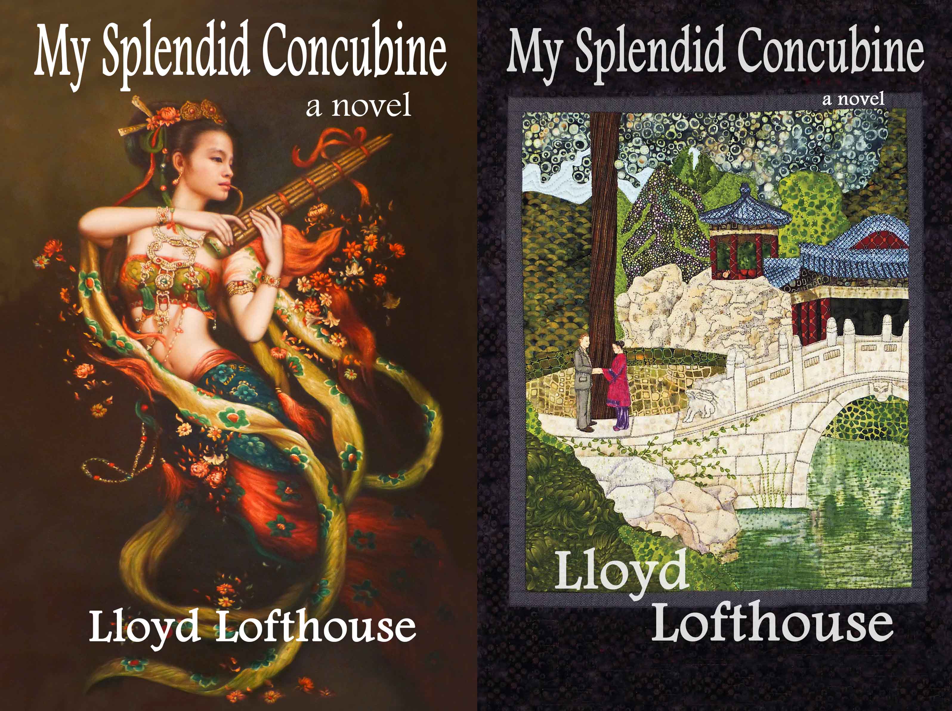
Because of this, the first book I published that ended up with two covers was “My Splendid Concubine’s” 3rd edition when a fellow author said the paperback cover wasn’t working on Amazon as a thumbnail sized cover. I think it was because there was too much detail in the original art work.

LowRes_e-book-and-paperback-cover-together

The reason why authors need to rethink book covers has been explored by C.K. Abbott on her blog. She says, “Paperback book covers have to perform different jobs than Kindle covers.”

Here’s where I may have made my mistake—twice. For both “My Splendid Concubine’s” 3rd edition and “Running with the Enemy”, my first two novels, I commissioned an artist to create original art quilts and then took photos of the quilts to convert into book covers—those impressive art quilts now hang on our bedroom wall.

But here’s the twist. It’s all in the size. What looks great large doesn’t always work in a smaller size.

The original quilt for Concubine was 23 inches wide by 31 long, and the quilt for “Running with the Enemy” was 21 x 27. After I took the photographs, I shrunk them to 5.5 x 8.5 for the paperback covers.  On Amazon, those same covers were even smaller and the rich details in the original quilts were lost.

As an indie author in charge of every step of book production, it’s possible to get carried away—like I did—when it comes to experimenting with other art forms to create original book covers.

In another Blog post, Scarlett Rugers discusses how to choose the right font for your eBook cover. Rugers is an award winning book cover designer from Melbourne, and the work she displays on her site is stunning.

But cover art appears in more places than on a paperback or Amazon. Cover art needs to be effective in both a thumbnail and larger-than-life on a poster and Read Owl.com discusses this topic in Seven Tips for Great Cover Design.

Low Res e-book and paperback covers joined December 13

And at Book View Cafe.com we learn: “It is a fact that most potential customers for any particular ebook will first encounter the cover image as a thumbnail. With that in mind, cover designers have trended toward simple art, toward large type size rendered in straightforward fonts. Cover illustrations have been demoted to lesser importance. Graphic considerations reign.

“Unfortunately, far too many ebook designers are still thinking like print book designers. The only difference is they have applied the rule of making covers that are legible at thumbnail size. They’re repeating that mantra until they throw the baby out with the bathwater.”

If you want to see more stunning book covers, check out the winners of the e-Book Cover Design Awards, September 2013, by clicking on this link for The Book Designer.com.

_______________________

Lloyd Lofthouse is a former U.S. Marine and Vietnam Veteran,
who taught in the public schools for thirty years (1975 – 2005).

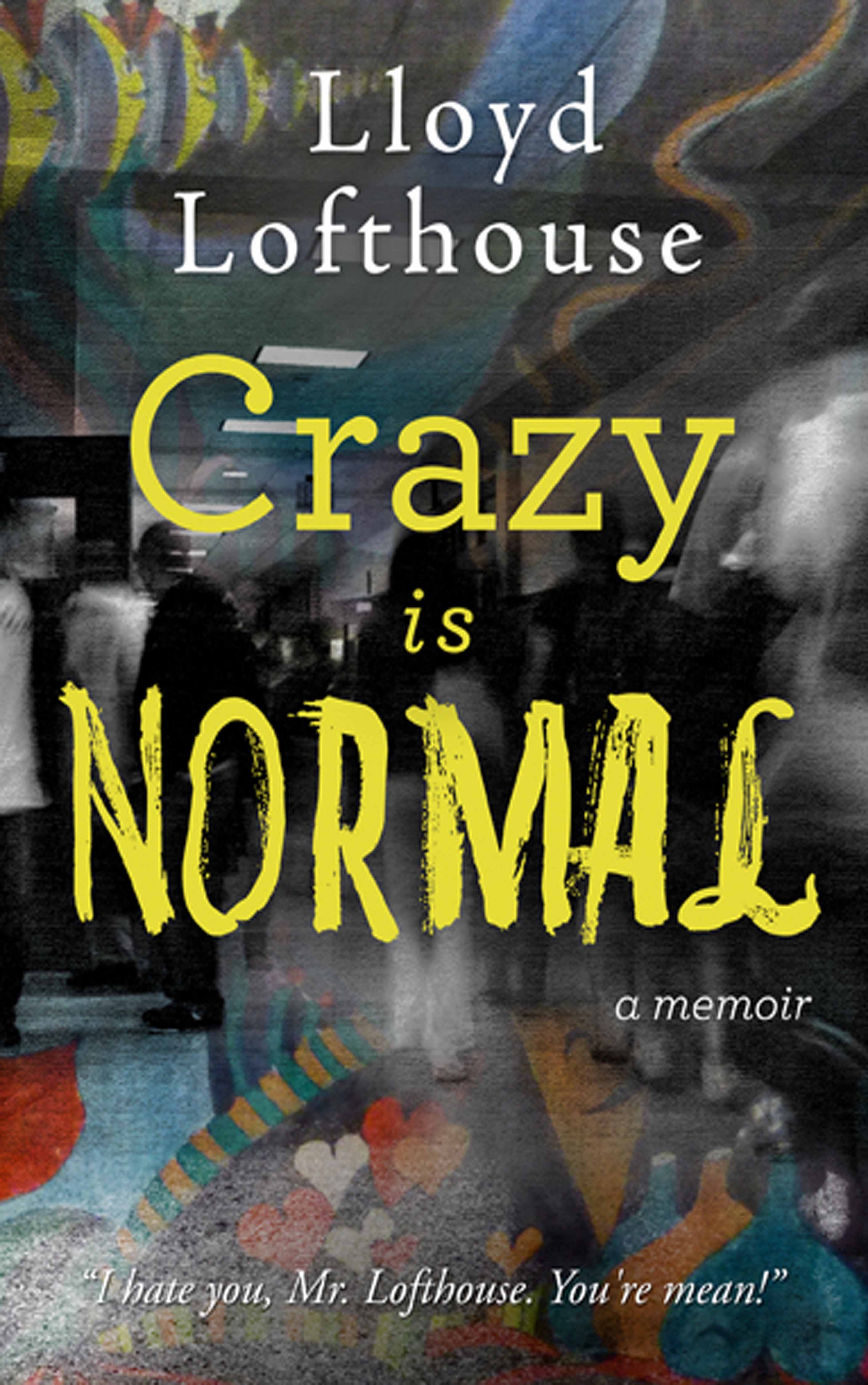
His third book is Crazy is Normal, a classroom exposé, a memoir. “Lofthouse presents us with grungy classrooms, kids who don’t want to be in school, and the consequences of growing up in a hardscrabble world. While some parents support his efforts, many sabotage them—and isolated administrators make the work of Lofthouse and his peers even more difficult.” – Bruce Reeves

lloydlofthouse_crazyisnormal_web2_5

Lofthouse’s first novel was the award winning historical fiction My Splendid Concubine [3rd edition]. His second novel was the award winning thriller Running with the Enemy. His short story A Night at the “Well of Purity” was named a finalist of the 2007 Chicago Literary Awards. His wife is Anchee Min, the international, best-selling, award winning author of Red Azalea, a New York Times Notable Book of the Year (1992).

To follow this Blog via E-mail see upper left-hand column and click on “FOLLOW!”

Responses to “Discover how Amazon changed book cover design and why authors need to pay attention”

  1. Shawn L. Bird Avatar

    I’m a teacher (and author), too. Your experience above sounds horrendous. I’m glad to be in rural Canada! I don’t believe we can deal with any of the big ‘education’ issues without addressing poverty. Statistically, academic outcomes correlate to income levels. This is why Finland is so successful. Their amazing social policies and equity in the schooling aid all citizens to academic success. NO private schools. Free tuition right to grad school. Free school lunches. Same funding to all schools. High levels of training for teachers (i.e. Masters). Early intervention for learning needs. Free living stipend for students. Fair welfare rates. Free health care. I doubt Americans will ever tolerate sharing the wealth for betterment of all; it’s not part of their national psyche, and the result is violence, ignorance, and more poverty.

    As to your cover- Here are my 2c. Consider a view of kid being carted off by police. Teacher and a freaking out kid. 2 kids facing off with weapons in school yard. Angry/desperate/fearful kid with a weapon. A cover should focus on individuals not the place. Buildings are static and boring. People & their stories are interesting. Hint at those stories.

    1. Lloyd Lofthouse Avatar

      Thank you for your 2c on the cover.

      As for dealing with poverty and education in the U.S. It’s challenging because each state is like a different country when it comes to public education. In the U.S., there is this thing called states rights and education is supposed to be one of those rights without federal government meddling or intervention—that’s supposed to be unconstitutional. For that reason, public education in the United States is all over the place for quality and a political, corporate and legal war is brewing because of the Common Core agenda out of Washington DC that’s pretending to be from the states when it clearly isn’t. It doesn’t help that several billionaires in the private sector are meddling in this issue too.

      In addition, about half of the states offer early childhood education programs but they are not the same in each state and sometimes from district to district and the US has about 14,000 different school districts. Some of these early childhood education programs are horrible and some are good. Then there are the other half of the states that offer nothing in early childhood education and most of those states are controlled by the GOP in addition to having the highest rates of poverty and illiteracy.

      For instance, New York state spends the most at almost $20,000 per student, but than Utah spends the least at almsot $6,000 per student. And wealthy communities in each state spend much more then communities with high rates of poverty.

  2. […] Lofthouse reflected on how ebooks require a changed approach to book cover design — again, interesting […]

  3. Author Tamie Dearen Avatar
    Author Tamie Dearen

    Reblogged this on Writing, Reading, Books, and Stuff and commented:
    Great post on book covers by LLoyd Lofthouse.

  4. […] Every writer wants to earn a living from their writing. Joanna Penn gives us 7 smart ways to earn multiple streams of income from a single manuscript. In publishing, print books outsold ebooks for the first half of 2014. Also, Lloyd Lofthouse examines how Amazon changed book cover design and why authors need to pay attention. […]

  5. AuthorJoePerroneJr Avatar

    I totally agree with your article. I design all my own covers, as well as covers for other authors. I always stress that the cover MUST look good as a thumbnail or it’s useless. I had done what I thought was a terrific cover for one of my books, Opening Day: A Matt Davis Mystery, but after lackluster sales, I decided it needed a makeover. Not only did sales improve with the new cover, but it ended up winning a B.R.A.G. Medallion. Good post.

    1. Lloyd Lofthouse Avatar

      Thank you.

      Curious, I looked up B.R.A.G. Medallion.

      For anyone else interested, here’s info on the B.R.A.G. Medallion: http://www.bragmedallion.com/

  6. Kay S Avatar
    Kay S

    I read your post about authors finding readers and after reading this one, I see that we also compete with the book cover to catch the readers attention because there is so many books to pick from.

  7. Lilliana Avatar
    Lilliana

    Having read this I believed it was rather enlightening.

    1. Lloyd Lofthouse Avatar

      Thank you. I’m glad you got some info out of it that may be helpful.

  8. How I sold almost 2,000 books in twenty hours | Lloyd Lofthouse Avatar

    […] Discover how Amazon changed book cover design and why authors need to pay attention […]

  9. Adrijus Guscia (@AdrijusG) Avatar

    Great post! It is sad that the details are lost from illustrations but they do work better for physical books. These days illustrations can still be super impressive but have to be simplier, great place for inspiration can be http://www.behance.com.

    1. Lloyd Lofthouse Avatar

      Thank you. I saw some eye-catching work on Behan.com when I clicked the link.

  10. lenora Avatar
    lenora

    Two covers. One for Amazon and one for paperback. I think that works. I’ll try it out.

    1. Lloyd Lofthouse Avatar

      or one cover if it works for both.

  11. Jeri Walker-Bickett (@JeriWB) Avatar

    Greetings via #MondayBlogs. I’ve kept my two eBooks covers extremely simple for the sake of hoping they look okay, but it seems self-made covers always look better to those who make them 😉 When I’m ready to get more serious, I’ll definitely hire someone to make my covers.

    1. Lloyd Lofthouse Avatar

      After I wrote that post, I contacted the artist in Australia and eventually signed a contract for her to design the cover for my next book.

  12. Sara Avatar
    Sara

    You should check out the covers by this lady, they are remarkable in every way….
    http://selfpubbookcovers.com/index.php?option=com_author&view=searchartist&username=fantasyart

    1. Lloyd Lofthouse Avatar

      They are stunning but are they all from one artist. The prices are right too. Thanks for sharing.

      1. Isham Cook Avatar

        Except those covers ain’t literary fiction!

      2. Lloyd Lofthouse Avatar

        True. By the way, I didn’t mention to you that I contacted your cover artist in Australia and set up an appointment in February to work on the cover of my next book. She’s very organized.

      3. Isham Cook Avatar

        Yeah, she’s very efficient. I’ll be working with her again soon.

  13. […] Discover how Amazon changed book cover design and why authors need to pay attention […]

  14. Isham Cook Avatar

    Serendipity! I was going to suggest the cover artist I use, Scarlett Rugers, and then lo and behold her name comes up later in your post! But the covers of your novels don’t look like they were designed by her.

    1. Lloyd Lofthouse Avatar

      No, the covers of my novels were not designed by her. But maybe I should consider her for the next book. While researching for this post, I ran into her work for the first time. Impressive.

  15. Richard Sutton Avatar

    Lloyd, one of the best sources for beta tests on covers are bookstore owners. If you can do a blind sheet test — Your covers mixed up with other genre covers on a one-page printout or screen shot — then get their votes and the reasons why. I also like “blind” genre reader tests similar to the above.

    1. Lloyd Lofthouse Avatar

      That’s a good suggestion. But I have to have a cover idea before I can create the Beta covers. Those ideas or not sprouting. The only idea I’ve had so far is a shot of the high school where the story takes place.

      My next book will be a memoir based on a daily journal that focused exclusively on my teaching. I wrote that daily journal in the early 1990s during one specific school year. Every day when I got home, I wrote a detailed entry into that journal. During the day, I kept notes on 3×5 cards, used my copies of referrals, etc. to help with facts that were still fresh in my mind. If I had slept before writing an entry I would have lost some of the details.

      The actual daily journal runs more than 500 pages printed out. The memoir won’t be as long. I condensed it to cut out as much repetition as possible but the repetition is also part of the story so I can’t lose that either. A teacher’s life is a treadmill that repeats itself daily but with different lessons to teach.

      The book will be called, “Crazy is Normal, a classroom expose”. I taught in the same district for thirty years and for twenty-seven of those years I taught out of schools in a barrio that was infested by violent mufti-generational street gangs at war with each other. Weekend killings were common.

      In fact, I witnessed drive buy shootings from one of the classrooms I taught out of that was next to a street. The memoir starts in that classrom and then moved to another, safer room.

      The high school where this memoir takes place had its own campus police force of at least a half dozen officers with two on constant patrol on bikes so they could reach a problem scene faster. Everyday at lunch, a sheriff’s deputy would show up and park his squad car on the mall where the kids could see him and his shotgun. After lunch when the kids were back in class, the sheriff’s deputy left but squad cars from more than one police department were often seen parked along the curb outside the main office because kids were constantly being arrested and carted away to juvie.

      I was threatened annually but no one ever tried to carry out the threats. Being a former US Marine and Vietnam vet served me well in that job.

      Everyday, it was like walking into a war zone to teach and too many of the kids were not interested in learning. To teach that segment of the population was a constant struggle and schools like this exist in every major city in the United States. There are thousands of teen gangs with an estimated million members in the US and that doesn’t even count the 22% of kids that live in poverty and poverty is the cause for many tough kids who are difficult to teach. The public schools teach about 51 million children so that means more than 11 million from poverty. And most of these kids are concentrated outside urban communities that are predominately white or Asian.

      The residential community that surrounded the schools where I taught was so dangerous that local police often did not patrol those streets at night because of snipers.

      1. Richard Sutton Avatar

        Lloyd — did you ever see the film, “Detached” with Adrian Brody? Sort of a cross between Mr. Chips and Frank McCourt’s ‘Tis running smack into a roadside IED. I think the idea has great reader potential!

      2. Lloyd Lofthouse Avatar

        This is the first I’ve heard of “Detachment” with Brody. I just ordered the DVD from Amazon. Thanks. For anyone reading this who is interseted, I’ve provided a link to the DVD on Amazon and the film’s trailer from YouTube.

        The problem is that in America there is a this media cultivated, popular politically correct thinking outside of education among the people who know little to nothing about what’s going on in the public schools that great teachers can do it all by themselves and teach 100% of the kids to be ready for college by age 17/18 and that the teachers who can’t do this are incompetent and must be fired. And schools that can’t find enough great teachers must be closed and the education of those kids turned over to the private sector, for example Wall-Mart. The Walton family, the wealthiest family on the planet, is just one example of the people behind this movement to destroy the public schools.

        This popular misconception does not include parents or students as part of the learning process. Only teachers are held accountable to teach kids who are difficult to teach with a 100% success rate. This thinking led to Bush’s “No Child Left Behind” and Obama’s even worse “Race to the Top”. The only people who are punished if the impossible goals set by these two federal acts are not met are the teachers and administrators in the public schools. Kids are not help accountable to learn. Parents are not held accountable to support teachers and learning.

        A book that goes to the heart of this issue is “Reign of Error” by Diane Ravitch. I HIGHLY recommend reading this book. Ravitch explains and strips bare the privatization movement behind the destruction of America’s public school, a movement that has been working for more than thirty years with the goal to get rid of the public schools and have access to the more than one trillion dollars spent by the states on public education annually. She names names and shows the history of this movement and reveals the damage it is doing.

      3. Lloyd Lofthouse Avatar

        I posted my review of Detachment on my Crazy Normal Blog @ http://crazynormaltheclassroomexpose.com/2013/12/22/detachment-a-film-review-and-commentary/

        Actually, its more of a commentary about public education in the United States than a review.

      4. Richard Sutton Avatar

        Now, when it comes to covers for your dysfunctional High School book, how about a close up of the teacher’s desktop with a piece of chalk lying next to an apple… with a worm coming out of it? Dark background…

      5. Lloyd Lofthouse Avatar

        That’s an idea. Thank you. I may have to substitute the chalk for a white-board marker. I wonder how many chalk boards are still in the schools. The desk would probably have gang graffiti carved into it too.

  16. Teepee12 Avatar

    If I ever write another book, I will have to entirely rethink my concept of cover art!

    1. Lloyd Lofthouse Avatar

      That’s where I’m at. I learned my lesson. I’m thinking that for my next book, I’ll put together several covers and then post them on the appropriate Blog for Beta input to decide which one would be best. Sort of like a contest, with a drawing to give away one book free, for those who participate and give their opinions.

  17. Behind the Story Avatar
    Behind the Story

    An excellent article with good links. Thank you.

    1. Lloyd Lofthouse Avatar

      You’re welcome. The Fussy Librarian just came out with an e-mail newsletter about the importance of book covers.

  18. Richard Sutton Avatar

    Exactly Lloyd, exactly. It’s why I stopped using illustration in favor of simple photography. On the other hand, in some genres, such as modern fantasy and romance, illustration is almost required, but cover designers are better able to make the typographic elements carry the burden in the TN sizes. I think this has been a learning process for everyone. By the way, I really like the cover of Running. Really evocative of Southeast Asia.

    1. Lloyd Lofthouse Avatar

      Thank you for the feedback on Running. Wasn’t sure it worked.

Leave a reply to Behind the Story Cancel reply

This site uses Akismet to reduce spam. Learn how your comment data is processed.